Custom Fields Tab in Process Settings
Custom Fields lets you to create the custom fields and use them in the campaign.
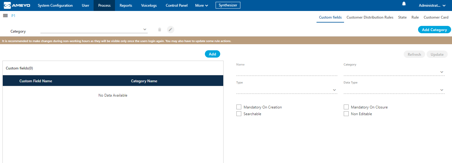
Figure: Custom Fields
Cautionary Line
A cautionary line is present at the top of the page which contains the following line
It is recommended to make changes during non-working hours as they will be visible only once the users login again. You may also have to update some rule actions.
The line is self-explanatory that after the creation of any custom field, the custom field will reflect at the agent's screen only when the agent needs to login again. That's why it is recommended to create custom fields at the non-working hour.
Default Category of Custom Fields
A default category of Custom Fields named "Default Category" will be created in the backend database while creating a Process. When the Administrator will try to create the Custom Fields without creating a Custom Category, then the Custom Fields will be assigned to "Default Category" by default. Hence, the Custom Fields assigned in "Default Category" will be displayed on the User Interface.
Add a Category of Custom Fields
Perform the following steps to create a category of the custom fields.
- Click "Add Category" button on the top left corner. It shows the following pop-up.

Figure: Pop-up to add a Category of Custom Fields
- Provide a name for the category and click "Save".
Manage Categories of Custom Fields
You can create multiple categories by performing these steps. The added categories gets listed in "Category" drop-down menu located on the top left corner.

Figure: Category Drop-down menu
Here, you can select any category to perform any of the following operations.
- Add Custom Fields
- View the list of existing Custom Fields
- Edit a Category: After selecting a category, click
 to edit a category using the following pop-up.
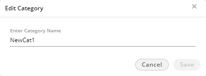
Figure: Edit Category
Here, you can change the name of category. Click "Save" to make the changes, else click "Cancel" to discard it. - Delete a Category: After selecting a category, click
 to remove a cartegory. The following warning message is displayed.

Figure: Deletion Confirmation Message
The deleted Category cannot be restored. The custom fields assigned to it will remain unassigned and you have to assign them to other category.
Click "Yes" to delete the selected category. Rather, you can click "Cancel" to keep it.
Create a Custom Field
Perform the following steps to create a custom field.
- Click "Add" button to add a custom field using the following pop-up.
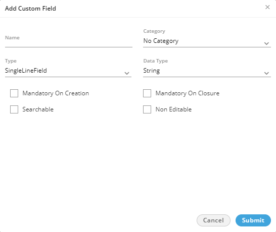
Figure: Pop-up to create a Custom Field
- Provide a name for the custom field.
- Select a category using the "Category" drop-down menu.
- In "Type" drop-down menu, select the type of custom field that you can to create.
- SingleLineField: Select it to create a single line custom field. You can use this to take the input in a single text line.
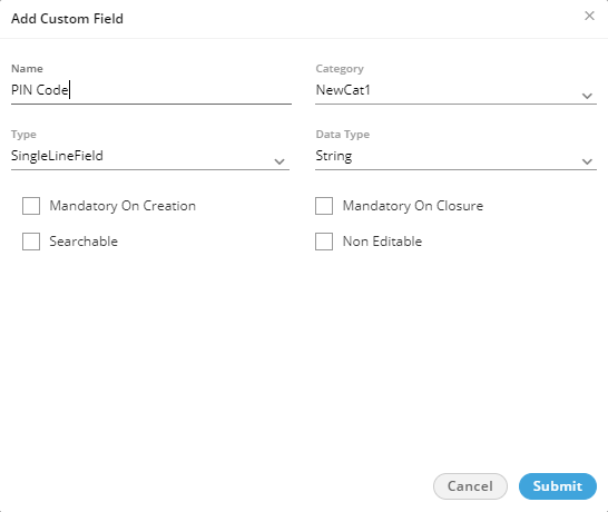
Figure: Single Line Text Field
Select any of the following data types for this field.- String
- Integer
- Decimal
- MultiLineField: Select it to create a multiple-line custom field or a textarea. You can use this to take the input in the multiple text lines.
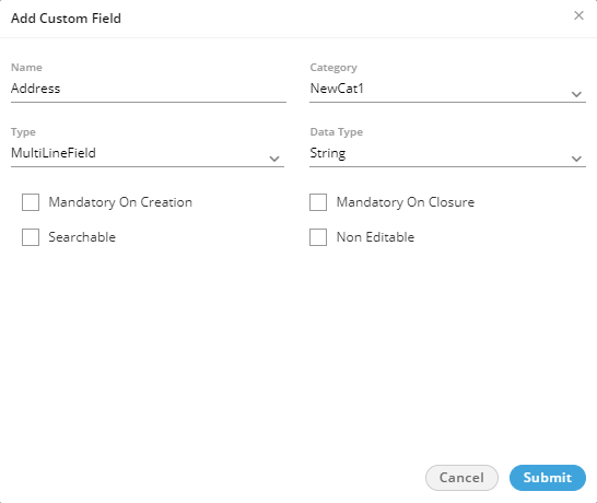
Figure: Multi Line Text Field
Select "String" as the data type. It is the only available data type here. - CheckBox: Select it to create custom checkboxes. The user can select any or multiple checkboxes. It shows the "Possible Value" section in the pop-up.
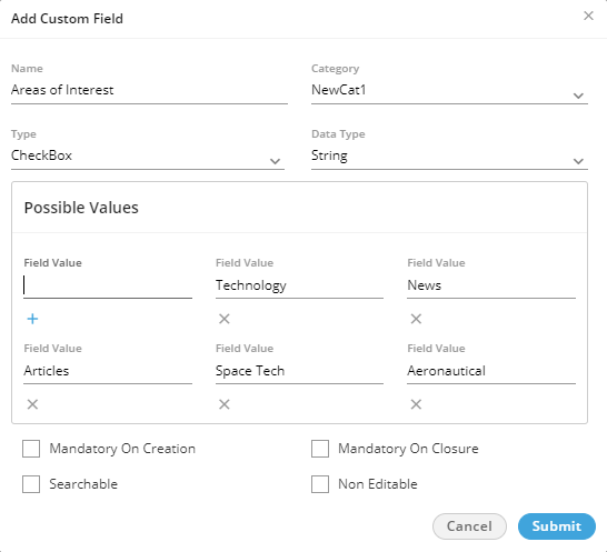
Figure: Checkboxes as Custom Fields
In "Possible Values" section, you have to provide the values for checkboxes that you want to create. In the text field, provide a value and click icon to add this textbox. You can create mulitple check boxes to provide the multiple options of a query.
Select any of the following data types for this field.- String
- Integer
- Decimal
- Boolean
- RadioButton: Select it to create custom radio buttons but the user can select only one of them. It shows the "Possible Value" section in the pop-up.
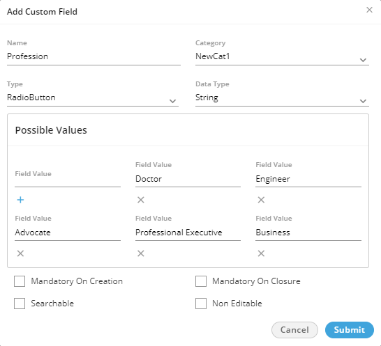
Figure: Checkboxes as Custom Fields
In "Possible Values" section, you have to provide the values for radio buttons that you want to create. In the text field, provide a value and click icon to add this textbox. You can create multiple radio buttons.
Select any of the following data types for this field.- String
- Integer
- Decimal
- SingleSelectionListBox: Select it to create a list containing multiple values but the user can select only one of them. It shows the "Possible Value" section in the pop-up.
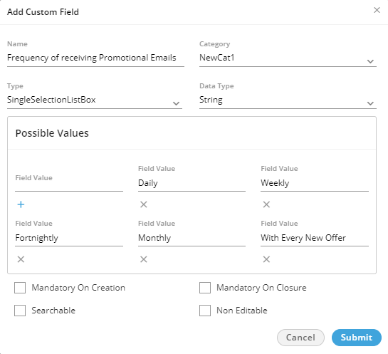
Figure: Single Selection List
In "Possible Values" section, you have to provide the values for the single selection list. In the text field, provide a value and click icon to add this textbox. You can provide multiple values here.
Select any of the following data types for this field.- String
- Integer
- Decimal
- MultiSelectionListBox: Select it to create a list containing multiple values. The user can select any or mutliple values.
Selecting it shows "Possible Value" section in the pop-up.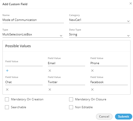
Figure: Multi-Selection List
In "Possible Values" section, you have to provide the values for the single selection list. In the text field, provide a value and click icon to add this textbox. You can provide multiple values.
Select any of the following data types for this field.- String
- Integer
- Decimal
- DependentSingleSelectionListBox: Select it to create a list containing values. The user has to select a value to proceed further. If multiple levels of such custom field are created, the values in the corresponding below level will be populated automatically and again the user can select only one of them.
Selecting it shows "Possible Value" section in the pop-up.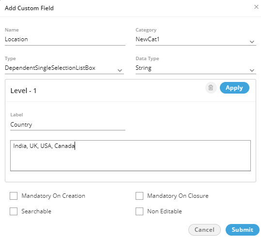
Figure: First Level of Dependent Single Selection List
Perform the following steps.- In "Possible Values" section, provide a label for the first level of the list.
- Type the comma separated values in the text area.
Scroll Bar Information: In case of multiple values, the scroll bar will be displayed in this text area.
- Now, you can click "Apply" to create the first level of the list.
- To create the second level list, click "Add Level" just below the first level.
- A drop-down menu lists all values of the First Level List. You can select a First Level Value
- Provide a label name and enter the multiple values in the comma separated format.
- Click "Apply" to create a second level list.
- Select another value of First Level List in the drop-down menu, provide a label, and then enter comma-separated multiple values.
You can scroll down to enter the values for the next fields.
- Click "Apply" to save the list.
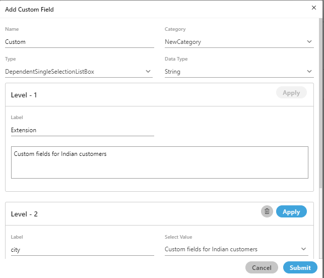
Figure: Multiple Levels of Dependent Single Selection List
When you are in third level, you have to select the value in first level to load its corresponding values in the second level list. After selecting a value in second level, the corresponding values in the third level list will be populated.
- You can create nested levels of Dependent Lists to meet your requirements.
- Select "String" as the data type as it is the only one available data type.
- DateField: Select it to create a list containing multiple values but the user can select only one of them. It shows "Possible Value" section in the pop-up.
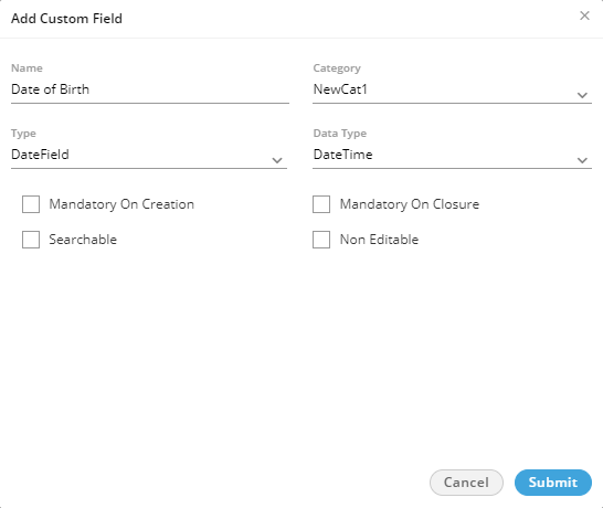
Figure: Custom Date Field
Select "DateTime" as the data type, which is the only available data type here. -
Regex: The Regex custom field is used to store the custom unique identifier for the tickets. Know more...
- Select any of the following options either to make the custom field mandatory either while creating the ticket or while closing it.
- Mandatory on Creation: Select it to make the custom field to be filled while creating the ticket.
- Mandatory on Closure: Select it to make the custom field to be filled while closing the ticket.
- Select "Searchable" to make this field searchable. The values of this field can be searched in the system.
- Select "Non-Editable" to make the field non-editable by the user. However, you can keep it unchecked to let the users edit it as per requirement. The created custom fields are listed on the left side.
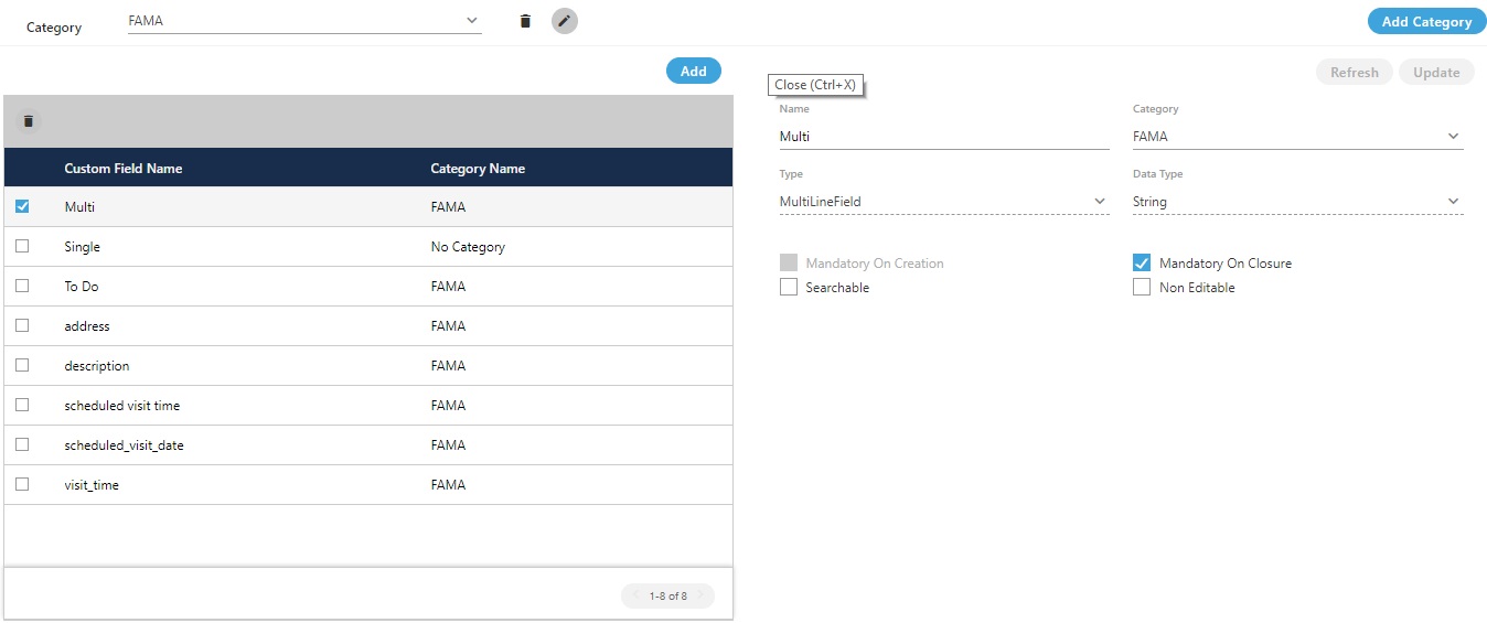
Figure: List of Custom Field
View and Modify Custom Field
Perform the following steps to view and modify the details of a custom field.
- Click the checkbox of a custom field to select it. Its details are displayed on the right side.
- You can change the following values here.
- Name
- Category
- Add or remove possible values
- Make it mandatory to fill either on the creation or the closure of a ticket
- Make it searchable or not
- Make it editable or non-editable by the user
- Click "Update" to apply the changes.
Rather, you can click "Cancel" to discard the changes.If any custom field is deleted or modified, then the agents are not required to logout and relogin to see the impact.
Delete a Custom Field
The deleted custom field cannot be restored.
Perform the following steps to delete a custom field
- Click the checkbox of a custom field to select it.
- Click the "Delete" button to delete it. The following message is displayed.

Figure: Deletion Confirmation Message