Dashboard of Interaction Campaign
Here, Supervisor can monitor all activities in the Interaction Campaign.
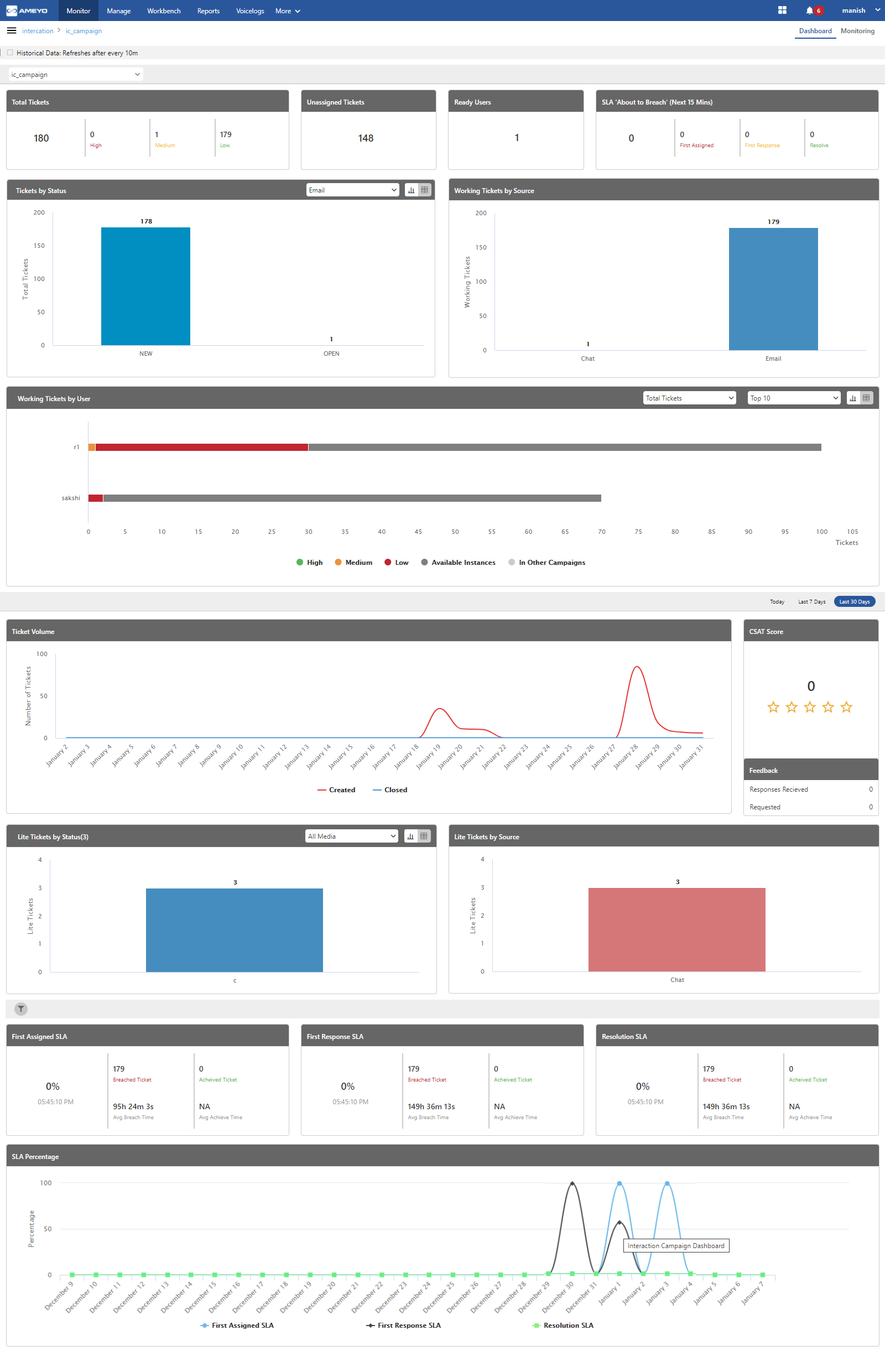
Figure: Dashboard of Interaction Campaign
Division of Areas in Interface of Interaction Campaign Dashboard
This Dashboard can be divided into the following two areas.
Static Dashboard Area: This part of Dashboard is displayed on top and remains static even if you change the duration.
Duration-based Dashboard Area: This part of Dashboard is displayed at the bottom and changes the value of its metrics as per the selected duration tab.
Queue Selection
In the top drop-down menu, the supervisor can select the queues according to the campaigns, to see the activities only in the selected queue. The metrics of both Static Dashboard Part and Duration-based Dashboard part changes as per the selected queue.
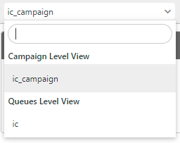
Figure: Queue Selection
Static Dashboard Area
This part of Interaction Campaign Dashboard is displayed on the top. The view of graphs included in this area will remain same even if duration is changed. It contains the following widgets.
Total Tickets
It shows the count of tickets with low priority, medium priority, and high priority with the sum of all three types of tickets.

Figure: Total Ticket
Unassigned Tickets
It shows the count of all unassigned tickets.
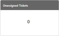
Figure: Unassigned Ticket
Ready Users
It is the number of agents who have set their status as "Auto-Chat ON" in a queue. he Supervisor can click "Ready Users" to reach at "Monitoring" page of the Interaction Campaign that will apply the filter to show the Ready Users automatically. It is a real-time data point, which is updated on the interface after every 10 minutes automatically.
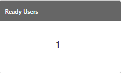
Figure: Ready Users
SLA "About to Breach" (Next 15 Minutes)
It shows the tickets with their status (First Assigned, First Response, or Resolved), of which SLA is about to breach within the next 15 minutes.

Figure: SLA about to Breach
Tickets by Status
It shows the bar graphs as per the status available in the system.
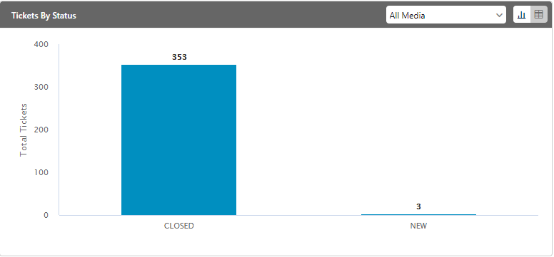
Figure: Tickets by Status
The X-Axis of this graph shows the status, whereas Y-axis shows the count of working tickets. The following text is displayed in the tooltip on the mouse hover over any bar.
<Status_Name>: <Count>
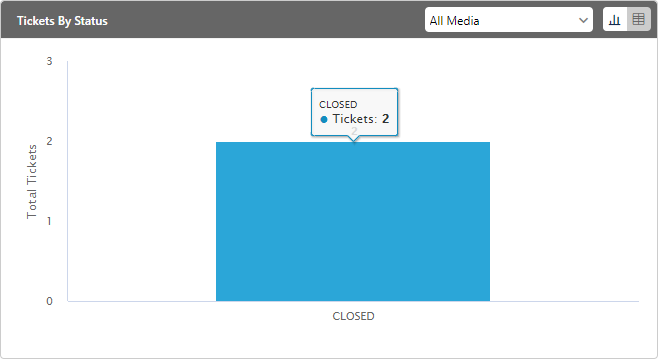
Figure: Tooltip for a stacked bar over the mouse hover
Blank Graph
If no ticket is available, then the blank graph is displayed with the following message.
It seems no ticket has been created yet.
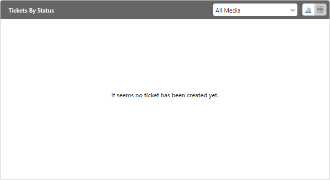
Figure: Blank Graph for "Tickets by Status"
"Tickets by Status" Table
The Supervisor can click ![]() icon to view "Tickets by Status" table.
icon to view "Tickets by Status" table.
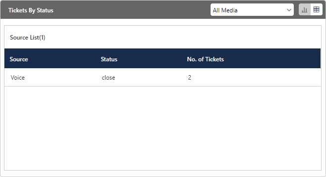
Figure: Tickets by Status Table
The Supervisor can click a column header to sort the table in the ascending order of its values. Click the same column header again to sort the table in the descending order of the values.
If no ticket is available, then the blank table is displayed with the following message.
No Data Available
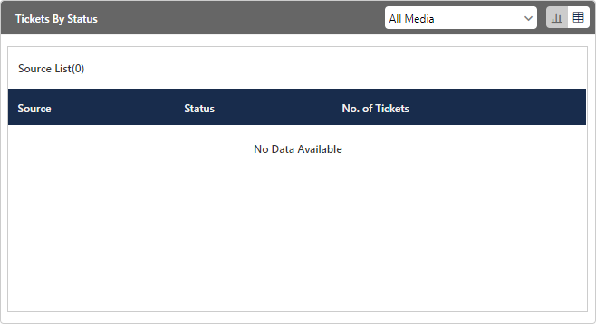
Figure: Blank Table for "Tickets by Status"
Filtration of Table or Graph as per Sources
The Supervisor can click "All Media" drop-down menu to view the bar graph or table of tickets by the source. Here, the sources, including Channel Addition Framework (CAF), voice, email, and others, are listed in the ascending order of the alphabet. As soon as a new source of tickets is added in the future, then it would be visible in this drop-down menu.

Figure: Sources of the Tickets
If no ticket is available for the selected source, then the blank graph or table is displayed with a message.
Working Tickets by Users
Working Tickets are those upon which the Ameyo Users are currently working, and they are not closed till yet. It allows the Supervisor of a business to view the working tickets as per their sources, including Channel Addition Framework (CAF). Each stacked bar represents a source.
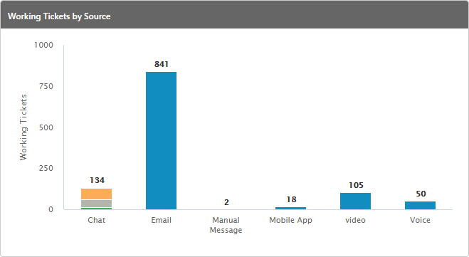
Figure: Working Tickets by Source Graph
The internal bifurcation will be displayed in the Chat Source as per the available Chat Channels.
The X-Axis of this graph shows the source of the tickets, whereas Y-axis shows the count of working tickets. The following text is displayed in the tooltip on the mouse hover over any bar.
<Source_Name>: <Count>
If no ticket is available, then it shows the following message.
It seems no ticket has been created yet.
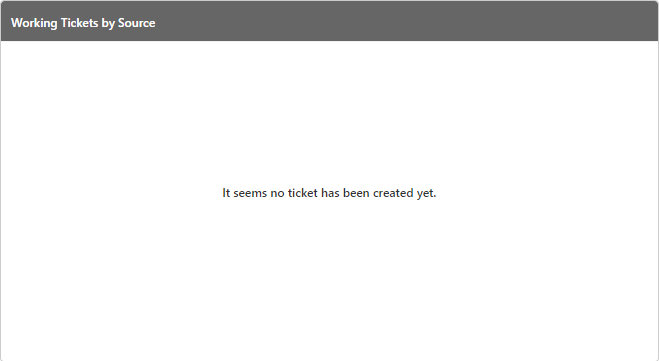
Figure: Blank Graph for "Working Tickets by Source"
If there is a problem in fetching the data, then the following message is displayed.
The data could not be fetched at this time. Please try again later.
Working Tickets by Users
Working Tickets are those upon which the Ameyo Users are currently working, and they are not closed till yet. It is a real-time data point, which is updated on the interface after every 10 minutes automatically.

Figure: Tickets by Users
The Supervisor can click ![]() icon to view "Working Tickets by User" table.
icon to view "Working Tickets by User" table.

Figure: Table view
In the table or graph view, the Supervisor can click "Total Tickets" drop-down menu.
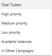
Figure: Drop-down menu to show the Ticket Types
It contains the following values.
Total Tickets: Select it to show all tickets. The Supervisor can click "Top Tickets" drop-down menu.

Figure: Show top or bottom tickets
Select "Top Tickets" to show the top 10 tickets of all types or select "Bottom Tickets" to show the bottom 10 tickets of all types.
High Priority: Select it to show only high priority tickets. Select "Top Tickets" to show the top 10 high-priority tickets, whereas select "Bottom Tickets" to show the bottom 10 high-priority tickets.
Medium Priority: Select it to show only medium priority tickets. Select "Top Tickets" to show the top 10 medium priority tickets or "Bottom Tickets" to show the bottom 10 medium priority tickets.
Low Priority: Select it to show only low priority tickets. Select "Top Tickets" to show the top 10 low priority tickets or "Bottom Tickets" to show the bottom 10 low priority tickets.
Available Instance: Select it to show those tickets that were assigned automatically to available agents directly. Select "Top Tickets" to show the top 10 such tickets or "Bottom Tickets" to show the bottom 10 such tickets.
In Other Campaigns: Select it to show those tickets that were assigned to the agents staffed in other campaigns. Select "Top Tickets" to show the top 10 such tickets or "Bottom Tickets" to show the bottom 10 such tickets.
The Supervisor can click  button to view all tickets of any type or priority.
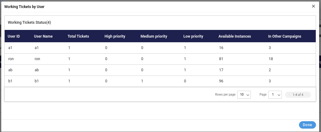
Figure: All Tickets
Duration-based Dashboard Area
This part of Dashboard is located at the bottom. It contains the following different duration tabs. You can select anyone of them to show the graph widgets in this area as per the selected duration.
Today: Click to view the activities in the selected campaign for the present day starting from 00:00 hour.
Last 7 Days: Click to view the activities in the selected campaign for the last 7 days.
30 Days: Click to view the activities in the selected campaign for the last 30 days.
Ticket Volume
It shows the statistics for the tickets.

Figure: Tickets Stats
The statistics of above graph shows the statistical representation for the newly created and closed tickets. The X-Axis shows the count of the tickets, and the Y-axis contains the date at which ticket was created or closed. You can hover the mouse at graph, and it will shows the total number of tickets created or closed on that particular date.
CSAT Score
It shows the number of feedbacks received from the customers divided by the number of feedbacks sent to the customers.
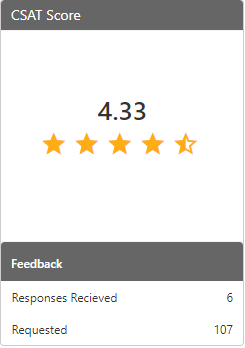
Figure: CSAT Score
It contains the two following parameters.
Responses Received: It shows the number of responses received on the feedback requests sent to the consumers.
Requested: It shows the number of feedback requests sent to the consumers.
Lite Tickets by Status
It shows the lite tickets as per their status. As Lite tickets have only one internal status; that is, "Closed", so only external status are displayed on this graph. The graph type has been changed from the pie chart to the bar graph.
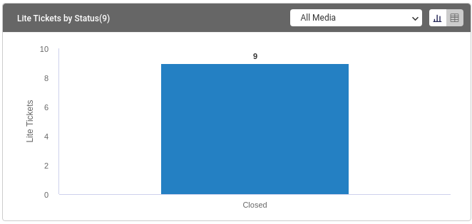
Figure: Lite Ticket by State
The Supervisor can change the duration of this graph by selecting the different durations between "Today", "Last 7 Days", and "Last 30 Days".
The X-Axis of this graph shows the source of the tickets, whereas Y-axis shows the count of tickets. The following text is displayed in the tooltip on the mouse hover over any bar.
<Status Name>: <Count>
Lite Tickets by State Table
It shows the table of the lite tickets which contains the total number of tickets with their states. Click "Table" icon of "Lite Tickets by State" matric.
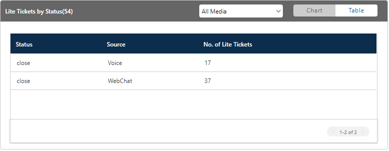
Figure: Lite Ticket by State Table
Lite Tickets by Source
It displays the bar graphs of lite tickets for different sources. Currently, there are two sources only: Chat and Voice. If another source is added in the future, then it's lite tickets will also be displayed here.
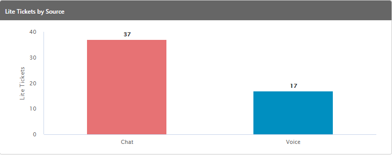
Figure: Lite Ticket by Source
The X-Axis of this graph shows the source of the tickets, whereas Y-axis shows the count of tickets. The following text is displayed in the tooltip on the mouse hover over any bar.
<Source Channel Name>: <Count>
Filtration of Tickets to display SLA Metric Graphs
Click ![]() icon to filter the tickets being displayed in the three SLA graphs.
icon to filter the tickets being displayed in the three SLA graphs.
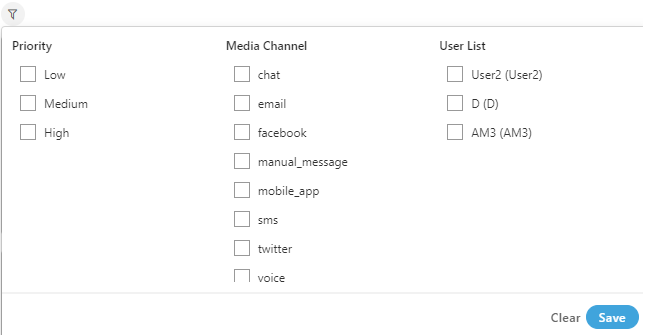
Figure: Filter Options
It contains the following filters.
Priority: It filters on the basis of the priority of the tickets. It is divided into three following parameters.
Low
Medium
High
Select any from the above parameters to filter the SLA.
Media Channel: It filters the SLA on the basis of the media channel from which source the ticket came. Some of the possible media profiles which we used for the testing are:
chat
email
facebook
manual_message
mobile_app
SMS
twitter
voice
The media channels are depending on the media sources which are integrated in the Ameyo. It does not show those media profiles which are not integrated in the Ameyo.
User List: It filters on the basis of the user names. It shows the SLA for the selected user's name. It contains the all the user names which are present in the Ameyo and are assigned in that IC campaign.
After selecting the filters, click "Save" to apply them. To clear the filters, click "Clear".
The display of following SLA graphs will be changed as per the selected filter.
First Assigned SLA
It shows the tickets with the first assigned SLA. It shows the count of tickets with both breached SLA and achieved SLA.
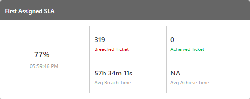
Figure: First Assign SLA
First Response SLA
It shows the tickets with the first response SLA. It shows the count of tickets with both breached SLA and achieved SLA.
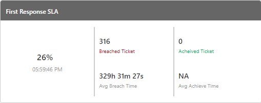
Figure: First Response SLA
Resolution SLA
It shows the tickets the Resolution SLA. Resolution SLA is the first resolve SLA. It shows the count of tickets with both breached SLA and achieved SLA.
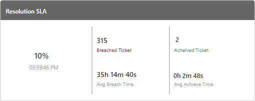
Figure: Resolution SLA
SLA Percentage
It shows the graph for "First Assigned SLA", "First Response SLA" and "Resolution SLA" of the tickets. Through this graph the supervisor can see the live status of the various SLA's achieved by users.

Figure: SLA Percentage
On X-axis, the percentage which is obtained comes and on the Y-axis, the graph for all the three SLA's came. All the SLA has different colors, so that the graph for all those comes according to the color, which helps the supervisor to distinguish between the various SLA's.